
Slack has one search. Notion has two. Here's why.
When AI search arrived, most teams added a tab. The few who didn't are about to eat everyone else's lunch.

Search is a solved problem, we thought. Type words, get results. Then Generative AI arrived and broke everything — not because it was worse, but because most teams didn’t know how to combine it with what already worked. So they didn’t. They built two search boxes instead of one and called it a feature.
That was the wrong call. And you can see it playing out in production right now across all of the major household names.
The two-lane mistake
When AI search arrived, the default product instinct was additive: keep the old search, add an AI-specific search layer on top or to the side. Ship both. Let users choose.
Notion did this. Open Notion today and you’ll find two distinct surfaces for finding things. There’s the classic search identified by the looking glass that does keyword matching and there’s Notion’s Ask AI — a separate invocation, a separate interface, a separate mental model.
You have to decide before you search which version of your question you’re asking.
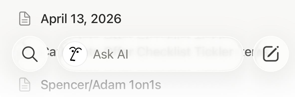
Is this a “find me the exact doc” question or a “summarize what we decided” question? If you guess wrong, you have to switch lanes, exit one interface for another, re-enter your query, and try again.
That’s not a search experience. That’s two search experiences stapled together with a feature flag.
The problem isn’t that Notion has AI search. It’s that they treated AI search as a separate product feature instead of an ingredient in the existing one. The interface tells you: we built something new, and we didn’t know where else to put it, or we could not build consensus to put it in just one place.
The unified bet
Slack and Google made a different call.
There’s one search bar in Slack’s desktop and mobile apps. You type. The system figures out what you wanted. Exact message from three weeks ago? It finds it. Fuzzy memory of a conversation about pricing strategy? It surfaces the thread. A question you’d phrase to a person — “what did we decide about the enterprise tier?” — comes back with a direct answer synthesized from your actual messages. Crucially, it also returns specific source documents (or in Slack’s case, messages) outside of the AI summary so you don’t have to choose between finding explicit documents and finding an answer.
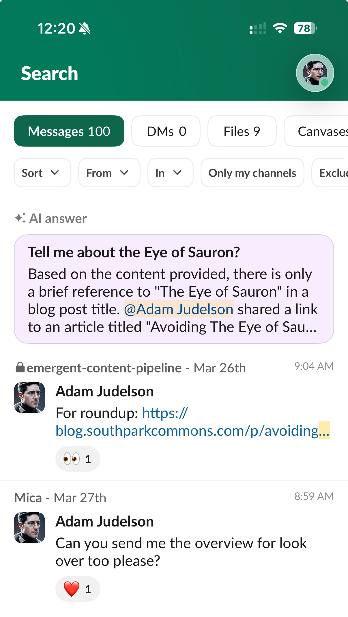
You never chose a lane. You never decided whether you were doing keyword search or AI search. You just searched and the interface handled the complexity of different styles of searches having different intents and engineering mechanisms behind them.
That’s what a unified search experience actually means: the product absorbs the complexity so the user doesn’t have to. The system decides in real time whether semantic retrieval or keyword precision is the right move — and often blends them when both matter. The user sees one result set AND an answer. The seams are invisible.
This is much harder to build. It requires engineering approach, possibly an agent or two, a unified ranking model or thoughtful UI that understands both signal types, and a design that doesn’t telegraph which engine answered (because it shouldn’t have to). It also requires conviction — the belief that your search box is a promise, not a portal to a choice.
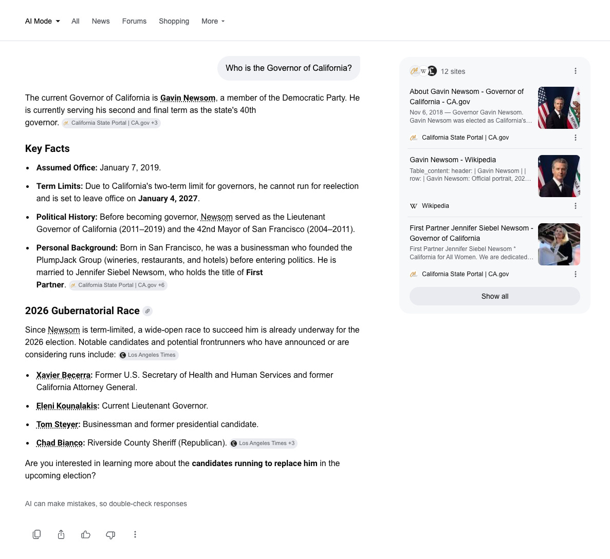
Google is also a runner up. You cannot see what is below unless you are in “AI Mode” so that shows their lack of strategic commitment to unification, but when you are in “AI Mode,” it does provide an answer and the sources, in this case side by side with the AI summary given clear precedence.
Why this will define the next era of knowledge tools
Every knowledge product — Notion, Confluence, Linear, Coda and every internal system ever created — is fundamentally a data storage and search product. The whole value proposition is “you put stuff in, you can find it later.” AI made that promise dramatically more powerful. Semantic retrieval means you can find what you meant, not just what you typed.
But that power is only realized if the interface trusts itself enough to unify the experience. Keyword matching did not suddenly go out of style, and it is critical in a great number of use cases where merely having the top-n ranked results for a query is insufficient.
When you split search into two, you’re telling users: we don’t know what you want, so you decide. When you unify it, you’re telling them: we’ve got it.
One is a gratifying product experience that yields immediate value. The other is an AI feature forced into a crowded UI.
The companies that figure out unified search — that build a single surface intelligent enough to handle both exact recall and fuzzy synthesis — will own knowledge UX for years to come. The ones that shipped “AI search” as a tab are going to spend the next few years explaining why their search is so complicated to use and why the results don’t match expectations or across surfaces.
Slack is showing what’s possible when a team actually commits. The question is who will follow.